PtComboBox
![[Previous]](prev.gif) |
![[Contents]](contents.gif) |
![[Index]](keyword_index.gif) |
![[Next]](next.gif) |
PtComboBox
A text field with a list of choices
Class hierarchy:
PtWidget --> PtBasic --> PtContainer --> PtCompound --> PtComboBox
For more information, see the diagram of the widget hierarchy.
PhAB icon:

Public header:
<photon/PtComboBox.h>
Description:
The PtComboBox class provides a widget that's built from two exported subordinate widgets: PtList and PtText.
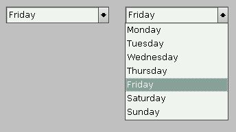
A PtComboBox widget provides a text-entry area and a list of choices.
You can type in the text field or choose a predefined entry from the list. The list can be either:
- Static
- Always present above or below the text field.
- Dropping
- You must click a button to see the list.
The widget behaves like a PtList or PtText widget, depending on which part has focus.
 |
You can't specify the selection mode for the list; Pt_ARG_SELECTION_MODE is blocked. The list always uses Pt_BROWSE_MODE. |
To select an item using the pointer, either click on an item or drag the pointer down the list and release the button when the correct item is highlighted. You can select only one item. If you drag the pointer, the list can scroll.
A blocking mechanism lets PtComboBox block the inheritance of certain resources from its subordinate widgets. This prevents any actions that would negatively affect the look and behavior of a PtComboBox widget. For more information, see the "Exported subordinate children" section.
Keyboard actions
The keyboard actions depend on which part of the PtComboBox has focus. If the text widget has focus, the keyboard actions are:
| Key | Action |
|---|---|
| /\ | Set the text to the previous item in the list |
| \/ | Set the text to the next item in the list |
| Alt-\/ | Display the list, highlighting the item corresponding to the current text |
The Alt-\/ action occurs only if Pt_COMBOBOX_ALT_DOWN is set in the widget's Pt_ARG_CBOX_FLAGS.
If the list has focus, the keyboard actions are:
| Key | Action |
|---|---|
| Enter | Select the current item (see "Current item" in the description of PtGenList) |
| /\ | Move to the previous item |
| \/ | Move to the next item |
| Pg Up | Move to the previous page |
| Pg Dn | Move to the next page |
| Home | Move to the first item |
| End | Move to the last item |
Callbacks
The following callbacks are associated with the text part of the PtComboBox and are invoked as described for PtText:
- Pt_CB_ACTIVATE
- Pt_CB_MODIFY_NOTIFY or Pt_CB_TEXT_CHANGED
- Pt_CB_MODIFY_VERIFY
- Pt_CB_MOTION_NOTIFY
- Pt_CB_MOTION_VERIFY
The following callbacks are associated with the list part of the PtComboBox and are invoked as described for PtList:
PtComboBox also defines the following callbacks for the list:
New resources:
| Resource | C type | Pt type | Default |
|---|---|---|---|
| Pt_ARG_CBOX_BUTTON_WIDTH | unsigned short | Scalar | 17 |
| Pt_ARG_CBOX_FLAGS | unsigned long | Flag | 0 |
| Pt_ARG_CBOX_MAX_VISIBLE_COUNT | unsigned short | Scalar | 0 |
| Pt_ARG_CBOX_SEL_ITEM | unsigned short | Scalar | 0 |
| Pt_ARG_CBOX_TEXT_FILL_COLOR | unsigned long | Scalar | Pg_LGRAY |
| Pt_CB_CBOX_ACTIVATE | PtCallback_t * | Link | NULL |
| Pt_CB_CBOX_CLOSE | PtCallback_t * | Link | NULL |
Pt_ARG_CBOX_BUTTON_WIDTH
| C type | Pt type | Default |
|---|---|---|
| unsigned short | Scalar | 17 |
The width of the drop button, in pixels.
Pt_ARG_CBOX_FLAGS
| C type | Pt type | Default |
|---|---|---|
| unsigned long | Flag | 0 |
Possible values:
- Pt_COMBOBOX_ALT_DOWN
- Enable the Alt-\/ keychord, which displays the list and highlights the item corresponding to the current text.
- Pt_COMBOBOX_MAX_WIDTH
- Make the combo box size itself to fit the longest list item.
- Pt_COMBOBOX_OPEN (read-only)
- If this bit is set, the list is currently open.
- Pt_COMBOBOX_STATIC
- Make the list field static and remove the drop button. If this bit is off, the list field is visible only when the drop button is pressed.
- Pt_COMBOBOX_TOP
- Place the list field above the text field. If this bit is off, the list field is placed below the text field. If there isn't enough space between the text field and the edge of the screen, the list may appear on the opposite side of the text field.
Pt_ARG_CBOX_MAX_VISIBLE_COUNT
| C type | Pt type | Default |
|---|---|---|
| unsigned short | Scalar | 0 |
The maximum number of list items that may be visible before scrollbars appear. If this is 0, the entire list is displayed without scrollbars.
You can use either this resource or Pt_ARG_VISIBLE_COUNT to control the size of the list, but you shouldn't use them both.
Pt_ARG_CBOX_SEL_ITEM
| C type | Pt type | Default |
|---|---|---|
| unsigned short | Scalar | 0 |
An index into Pt_ARG_ITEMS that indicates which list item is currently selected.
Pt_ARG_CBOX_TEXT_FILL_COLOR
| C type | Pt type | Default |
|---|---|---|
| unsigned long | Scalar | Pg_LGRAY |
The fill color of the text area.
Pt_CB_CBOX_ACTIVATE
| C type | Pt type | Default |
|---|---|---|
| PtCallback_t * | Link | NULL |
A list of PtCallback_t structures that define the callbacks that the widget invokes when the list is activated (i.e opened).
Each callback is passed a PtCallbackInfo_t structure that contains at least the following members:
- reason
- Pt_CB_CBOX_ACTIVATE
- event
- A pointer to a PhEvent_t structure that describes the event that caused the callback to be invoked, or NULL if there isn't an event.
- cbdata
- NULL
These callbacks should return Pt_CONTINUE.
Pt_CB_CBOX_CLOSE
| C type | Pt type | Default |
|---|---|---|
| PtCallback_t * | Link | NULL |
A list of PtCallback_t structures that define the callbacks that are invoked when you close the combobox's list.
Each callback is passed a PtCallbackInfo_t structure that contains at least the following members:
- reason
- Pt_CB_CBOX_CLOSE.
- event
- A pointer to a PhEvent_t structure that describes the event that caused the callback to be invoked, or NULL if there isn't an event.
- cbdata
- NULL.
These callbacks should return Pt_CONTINUE.
Exported subordinate children:
Unless the resources are already defined in PtComboBox, the PtComboBox class uses the resources of its exported subordinate children, PtList and PtText.
The PtComboBox class "inherits" all the resources of its exported subordinate children, with the exception of the following, which are blocked:
- Pt_ARG_SELECTION_MODE (defined in PtGenList and inherited by PtList) -- browse mode is always used.
- Pt_ARG_SELECTION_INDEXES (defined in PtList) -- PtComboBox replaces this with Pt_ARG_CBOX_SEL_ITEM because you can select only one item from the list.
Where PtComboBox and one of its exported subordinate children both define resources having the same name, the resource defined in PtComboBox takes precedence.
Inherited resources:
If PtComboBox modifies an inherited resource, the "Default override" column indicates the new value. If PtComboBox inherits a resource from one of its exported subordinate children, the default value assigned by the subordinate widget is inherited too; the "Default override" column shows this default value.
Pt_ARG_VISIBLE_COUNT
Set this resource to a nonzero value to resize the list to a multiple of the item height. If the number of items is less than this resource, blank items are displayed at the end of the list; if the number of items is greater than this resource, a scrollbar is displayed.
You can use either this resource or Pt_ARG_CBOX_MAX_VISIBLE_COUNT to control the size of the list, but you shouldn't use them both.
Convenience functions:
The PtComboBox widget and its exported subordinate PtList and PtText children define various convenience functions that make it easier to use the combo box once it's been created. Here's a brief overview:
- PtComboBoxListOpen()
- Open a combobox list.
- PtComboBoxListClose()
- Close an open combobox list.
- PtListAddItems()
- Adds one or more items to the list at a specified position.
- PtListDeleteAllItems()
- Removes all the items from the list.
- PtListDeleteItems()
- Deletes items in the list by name.
- PtListDeleteItemPos()
- Deletes a range of items by position.
- PtListItemExists()
- Determines whether or not an item exists within the list.
- PtListItemPos()
- Determines the position of an item within the list.
- PtListRemovePositions()
- Deletes items at specified positions.
- PtListReplaceItemPos()
- Replaces items by position number.
- PtListReplaceItems()
- Replaces items by item text.
- PtTextGetSelection()
- Gets the selected range from a PtText widget.
- PtTextModifyText()
- Modifies the contents of a PtText widget.
- PtTextSetSelection()
- Sets the selected range for a PtText widget.
|
|
|
|